AppleLaunch
- Apple’s macOS 26 Changes Everything — But Not Everyone Will Like It
- A Fresh Look That’s More Than Just Pretty
- Phone Calls on Mac? Yep, It’s Actually Useful
- Live Activities and Smarter Spotlight
- Safari, Messages, and the Journal App
- macOS 26 Tahoe: A Smarter, More Helpful Ecosystem
- macOS 26 Tahoe: So, Should You Upgrade?
Apple’s macOS 26 Changes Everything — But Not Everyone Will Like It

Nick Papanikolopoulos
June 9, 2025

Apple didn’t spend all its WWDC 2025 spotlight on iPhones and iPads. Quietly but deliberately, the Mac got its own moment. The next major release of macOS is here, and it’s called Tahoe—macOS 26, if you’re counting.
It follows macOS Sequoia and brings a mix of aesthetic refresh, functional upgrades, and subtle quality-of-life features that, collectively, make the Mac feel more in sync with Apple’s broader ecosystem. The update is rolling out this fall, but if you’re a developer—or just impatient—there’s a beta version landing this month, and a public beta in July. So, is this just a new coat of paint? Or something more?
Let’s walk through it.
A Fresh Look That’s More Than Just Pretty
The first thing you’ll notice—probably within seconds—is the new design language. Or, maybe you won’t notice it immediately. That’s kind of the point. The changes are sleek but restrained.
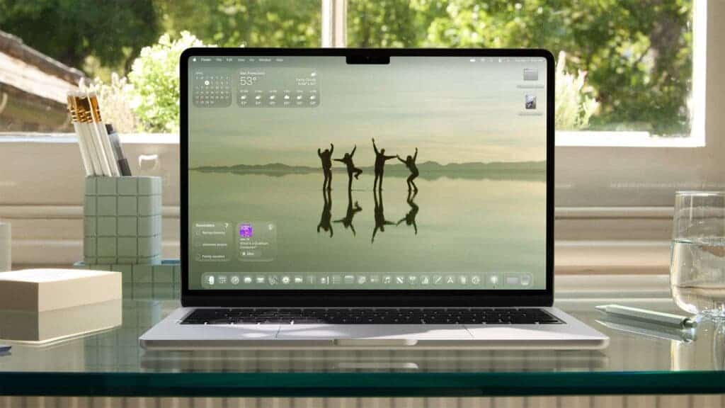
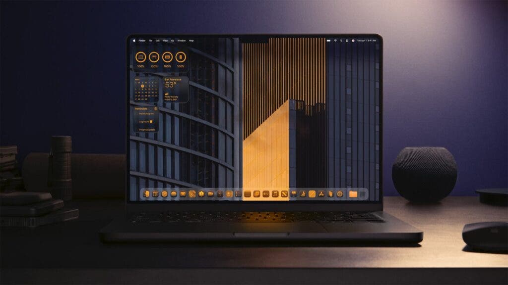
Tahoe brings macOS into tighter visual alignment with iOS 26 and iPadOS 26. That means a more unified feel across Apple devices, with translucent glass-like elements, redesigned toolbars, and a more spacious, content-first interface. It sounds vague, I know. But once you use it, there’s a sense that things breathe more.
The menu bar is now fully transparent, which sounds small—almost cosmetic—but it does something curious. It makes your display feel taller. Subtle? Sure. But noticeable, especially if you’re bouncing between devices all day.
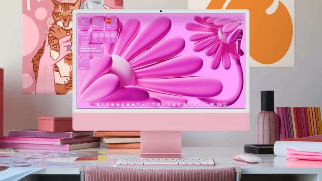
Customizations also go deeper. You can rearrange menu bar items and tweak Control Center more freely, yes, but that’s just the start. App icons now shift tones depending on light or dark mode, and folders can be color-coded or emoji-tagged. These are small flourishes that, somehow, stick. Maybe it’s just me, but changing folder colors helped me stay organized. Or at least pretend to.
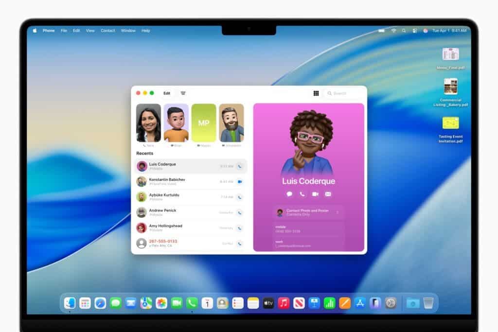
Phone Calls on Mac? Yep, It’s Actually Useful
There’s a new app that might not sound exciting, but ends up being surprisingly practical: Phone. Yes, like the one on your iPhone. Now it’s on your Mac too.
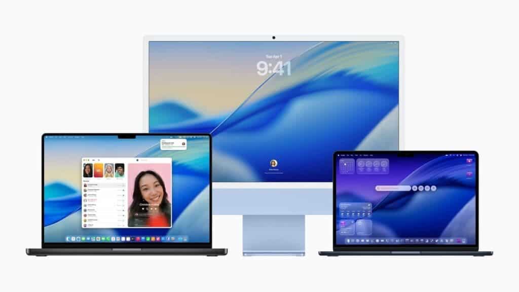
Thanks to Continuity, you can take calls directly on your Mac using your nearby iPhone’s cellular connection. Nothing revolutionary there—we’ve seen similar features before. But now the experience is more native. The interface mirrors iOS, complete with Favorites, Recents, and Voicemail. What’s new are features like Call Screening (asks unknown callers to identify themselves before you decide to pick up) and Hold Assist, which waits on hold for you. I tested the latter while calling an airline, and—honestly?—it saved me about 17 minutes of hold music. That’s worth something.
Live Activities and Smarter Spotlight
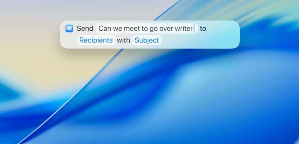
Live Activities from your iPhone can now show up right on your Mac’s menu bar. Think: your food delivery status, flight updates, sports scores—all without reaching for your phone. Spotlight has also gotten smarter. It now groups results more cleanly and surfaces the things you’re probably actually looking for, not just what matches the text. You can also filter by file type (PDFs only? Emails only?) and search across third-party cloud services—not just local files.
Read Also: iPadOS 26: Liquid Glass, Windowing Smarts, and a Subtle Shift Toward the Mac
There’s even a new “browse” view, which is a bit like rummaging through a digital junk drawer. That’s not a dig. Sometimes that’s exactly what you need.
Safari, Messages, and the Journal App
Safari sees some design tweaks: rounded, floating tabs and a more useful sidebar. It’s not groundbreaking, but the cleaner layout feels faster to navigate. Fewer clicks, less visual clutter.
Messages gets a bit more personality. Backgrounds, Polls, and an improved details view make group chats slightly more tolerable. If you use iMessage a lot, it’ll matter. Meanwhile, the Journal app has officially arrived on Mac. It’s essentially a digital diary, with support for multiple journals, syncing, and longer-form entries. I’ve started using it to jot down scattered project thoughts—and it’s better than having 19 open Notes.
macOS 26 Tahoe: A Smarter, More Helpful Ecosystem
Other updates fall into that “useful but not flashy” category:
- Photos gets a cleaner UI with “Liquid Glass” visuals and new ways to sort or pin collections.
- FaceTime now shows recent contacts using Contact Posters and has new controls that tuck out of the way.
- Notes adds markdown support and even lets you transcribe phone calls into notes—an unexpected power-user feature.
And there’s more under the hood. Accessibility gets a boost with new Magnifier options, Braille interface updates, and a clever motion-cueing system that helps reduce nausea if you’re using your Mac in a moving vehicle (a niche use case, but still appreciated).
Passwords now keep a version history—so if you ever wonder when you changed a password (or why), there’s a breadcrumb trail.
macOS 26 Tahoe: So, Should You Upgrade?
That depends. If you’re using an M-series Mac—and most of these features are exclusive to them—then yes, this is a worthwhile update. It doesn’t radically change the Mac, but it chips away at rough edges. It tightens the experience. It modernizes.
That said, it’s not without its quirks. The new visual style might take a moment to get used to. And the idea of taking phone calls on a laptop might still feel strange, even if it works well. Still, in a year when Apple’s clearly focused on convergence, macOS Tahoe makes the Mac feel less like a separate device—and more like a fluent part of everything else.
It’s not just about polish. It’s about presence.
Disclaimer: We may be compensated by some of the companies whose products we talk about, but our articles and reviews are always our honest opinions. For more details, you can check out our editorial guidelines and learn about how we use affiliate links.Follow Gizchina.com on Google News for news and updates in the technology sector.