newsTech
Gboard Unveils a Fresh Look with Dynamic Colors on Android
Frederick Nyame

February 5, 2025

Google has widely rolled out changes to Gboard’s Dynamic Color theme through a server-side update. This update brings visual improvements that make the keyboard look more consistent across different devices. The rollout follows months of testing, which started last year.
What Has Changed?
Previously, Gboard’s Dynamic Color theme used four different colors for:
- Letters
- Shift, Emoji/Comma, Period, and Backspace keys
- ?123 key
- Enter key
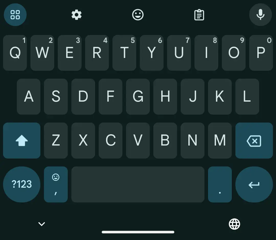 Image Credit: 9to5Google
Now, Shift, Emoji/Comma, Period, Backspace, ?123, and Enter all share the same color. Additionally, the 2×2 grid icon in the top-left corner now matches these keys. This new color scheme applies to both phones and tablets, making the keyboard’s appearance more uniform and clean.
A More Consistent, But Less Vibrant Look
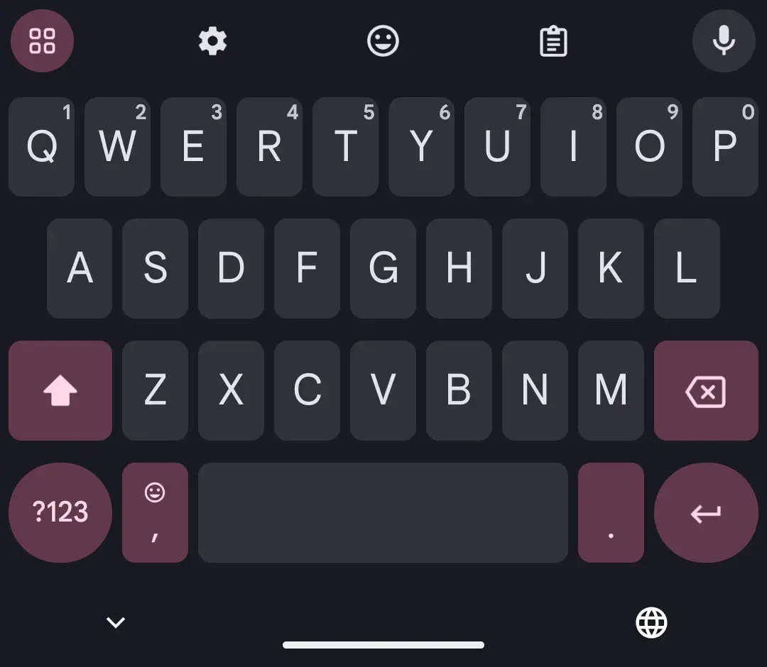 Image Credit: 9to5Google
This update improves consistency by giving Gboard a more balanced and smoother look. However, some users might find the Dynamic Color theme slightly less vibrant, depending on their wallpaper.
Join GizChina on Telegram
For those using dark mode, the keyboard now appears even darker, which may enhance readability in low-light conditions.
When Did It Roll Out?
- The update first appeared in beta versions of Gboard in late October 2024.
- Later, Google expanded it to the stable version for more users.
- Now, with Gboard version 14.9, these changes are widely available in both stable and beta channels.
How to Get the Update
If you don’t see the changes yet, try the following:
New Icon Change for Beta Users
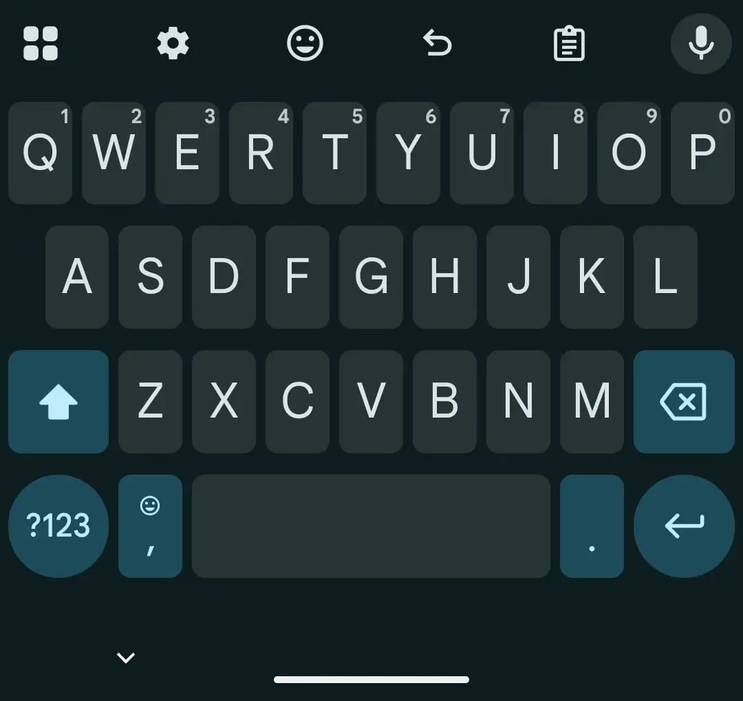 Image Credit: 9to5Google
If you use the Gboard beta version, Google has also updated the 2×2 grid icon. Previously, it was inside a circle. Now, it is fully filled in and no longer enclosed, making it look different from the voice search icon.
These visual updates bring a cleaner and more consistent design to Gboard, improving the overall user experience while maintaining Android’s Dynamic Color theme.
Disclaimer: We may be compensated by some of the companies whose products we talk about, but our articles and reviews are always our honest opinions. For more details, you can check out our editorial guidelines and learn about how we use affiliate links.
Source/VIA :
9to5Google